Custom Theme

Datura
· September 12, 2026
NOTE: Heads up! Custom themes are powerful but can be tricky to get right. If you find yourself with hard-to-read text or clashing colors, try tweaking the accent color or text colors to improve contrast. Remember, you can always reset to defaults if things get too wild. Problems with things that are caused by custom themes (eg: text wrapping to early, etc.) are not considered bugs. We are attempting to cover all bases, but there are some things that giving this much power is out of our control.
What the color change?
- Page Background
- The main background of the entire interface (behind everything).
- Card Surface
- Default background for cards, panels, or containers that hold content.
- Pressed Surface
- sliders and button (disabled toggle)
- Border
- Color for outlines/dividers between elements (cards, sections, inputs, etc)
- Body Text
- Main readable text for paragraphs and standard content.
- Muted Text
- Low-priority or subtle text (placeholders, hints, disabled info).
- Text On Accent
- Text that appears on top of accent-colored backgrounds for readability.
- Sidebar Background
- The background specifically for side navigation panels or menus.
- Card Hover
- Background shown when a user hovers over a card or interactive container.
- Highlight Surface
- Unknown
- Heading Text
- Used for titles or headings—high emphasis but slightly softer than pure white.
- Secondary Text
- Supporting text (labels, descriptions) with slightly less emphasis than primary.
- Accent Color
- Primary brand/action color used for buttons (enabled toggle), links, pronouns text, and key interactions.
- Corner Radius
- Controls how rounded UI elements are (buttons, cards, inputs).
- Lower = sharper, more rigid look
- Higher = softer, more modern/rounded feel
- Controls how rounded UI elements are (buttons, cards, inputs).
- Density
- Determines how compact or spaced out the interface is.
- Lower % (compact) = tighter spacing, more content on screen
- Higher % (spacious) = more padding, cleaner but less dense layout
- Determines how compact or spaced out the interface is.
How to share/import theme
Click the “Copy” button. This lets you share it with other people or post it publicly.
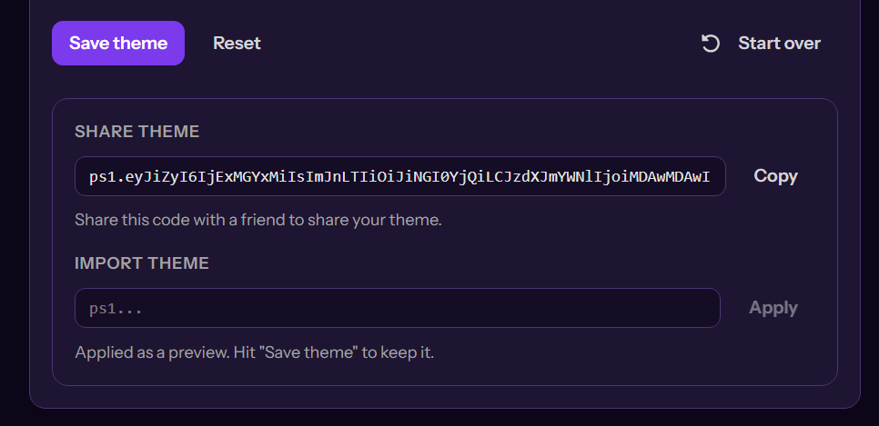
If you want to use other themes (or your own), copy the code, paste it into the “Import Theme” box, and then click Apply.
Tags:
customize
Was this helpful?